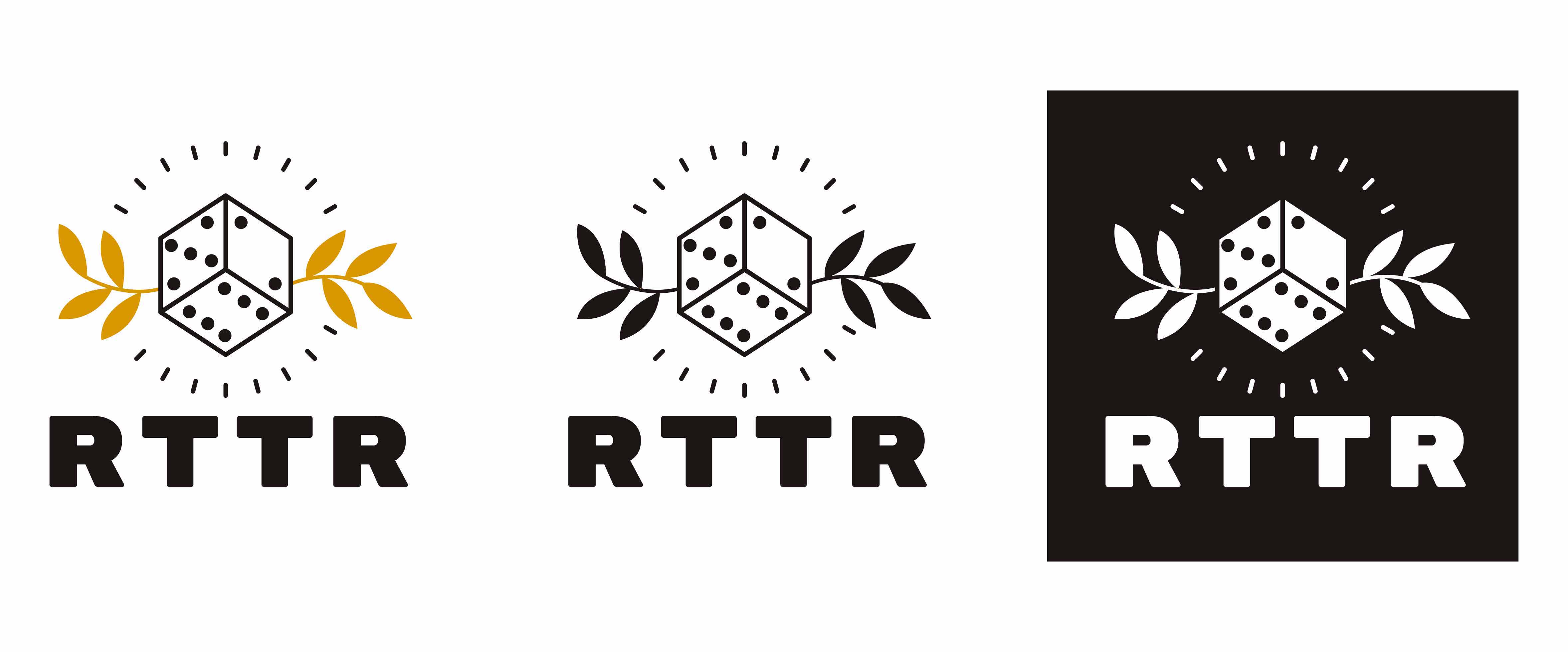
RTTR Rebrand
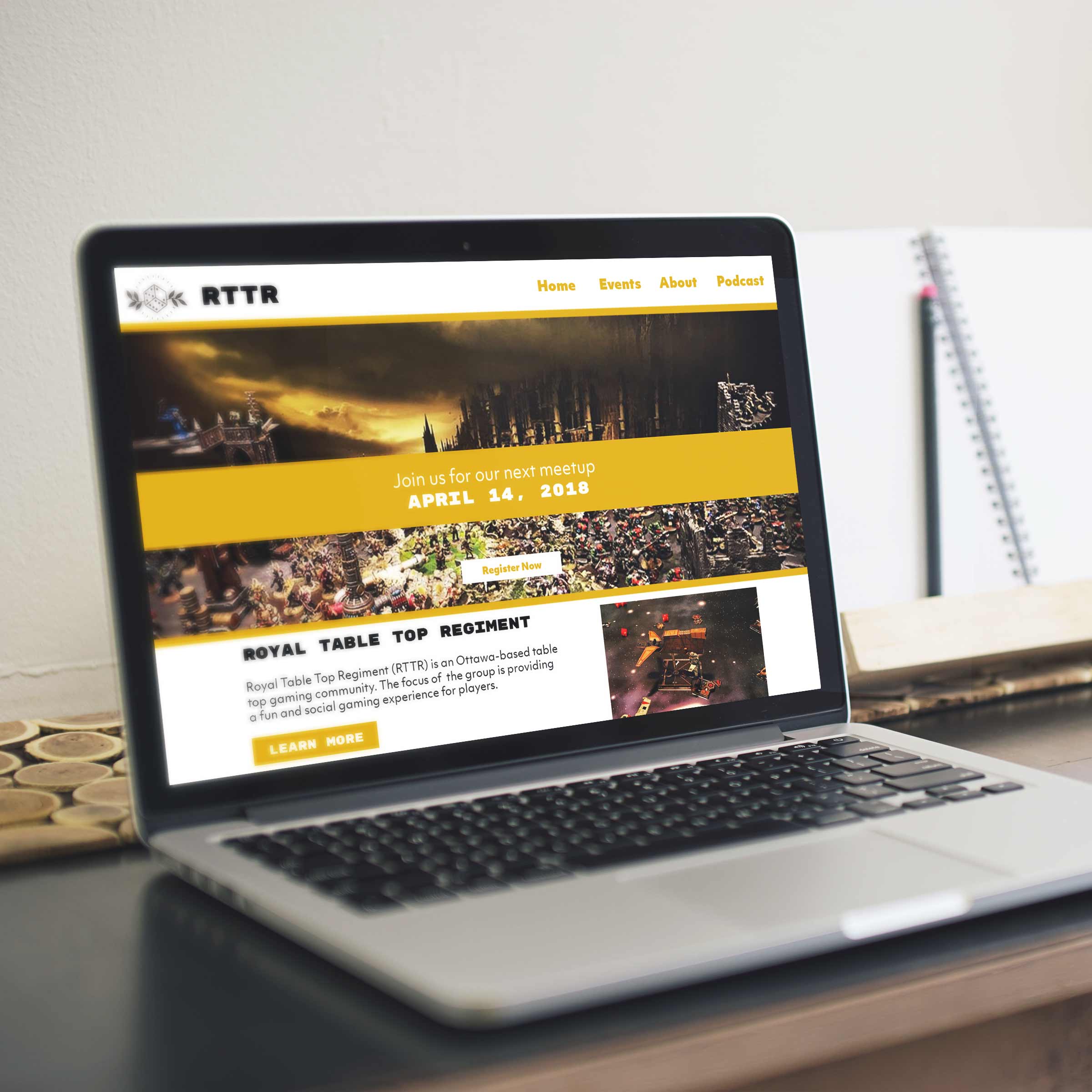
Royal Table Top Regiment (RTTR) is an Ottawa-based table top gaming community. The focus of the group is providing a fun and social gaming experience for players. The objective of this rebranding project was to create a more professional and polished logo for RTTR as they prepare to participate in and network at an international table top gaming convention this spring. A big consideration for this redesign was creating an accessible and inviting logo. RTTR wants to open their community beyond the usual suspects and create an approachable and open environment for people to learn and enjoy themselves.
Visual Design
Typography
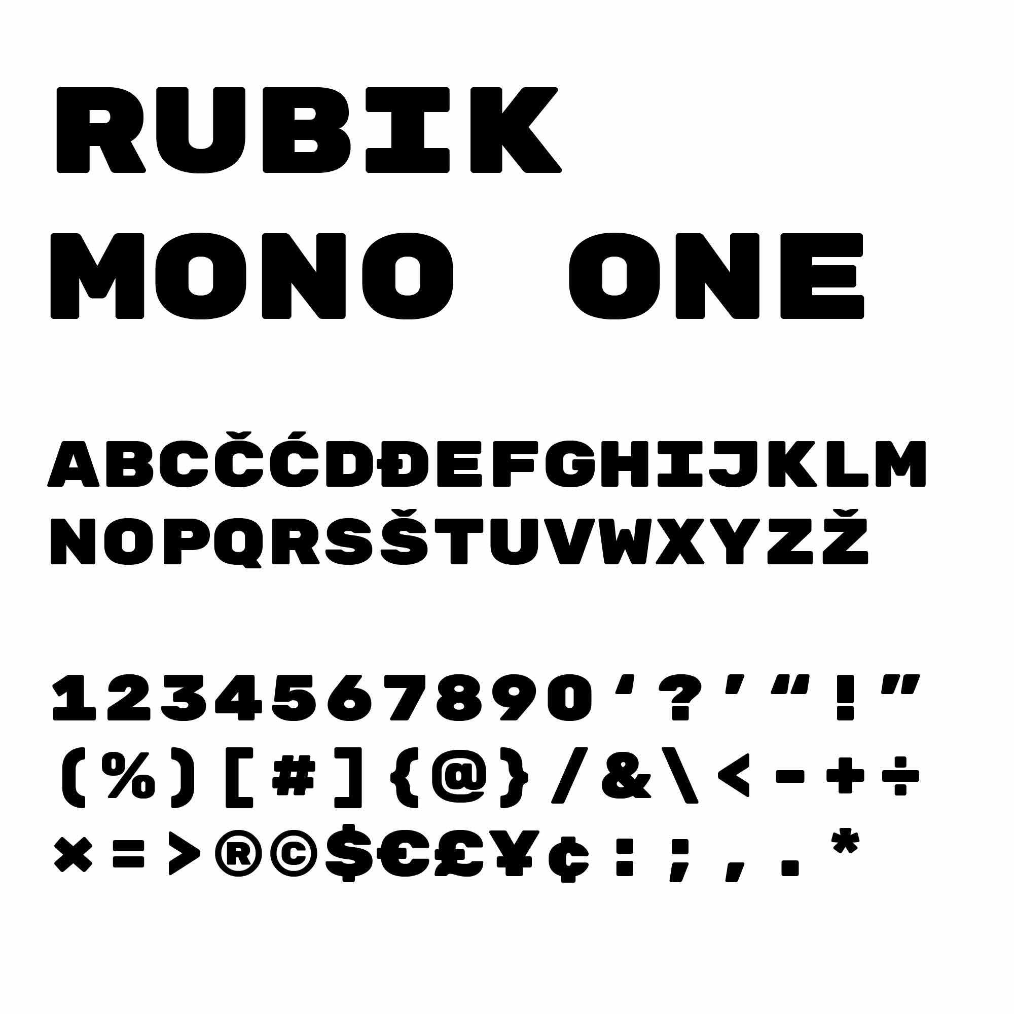
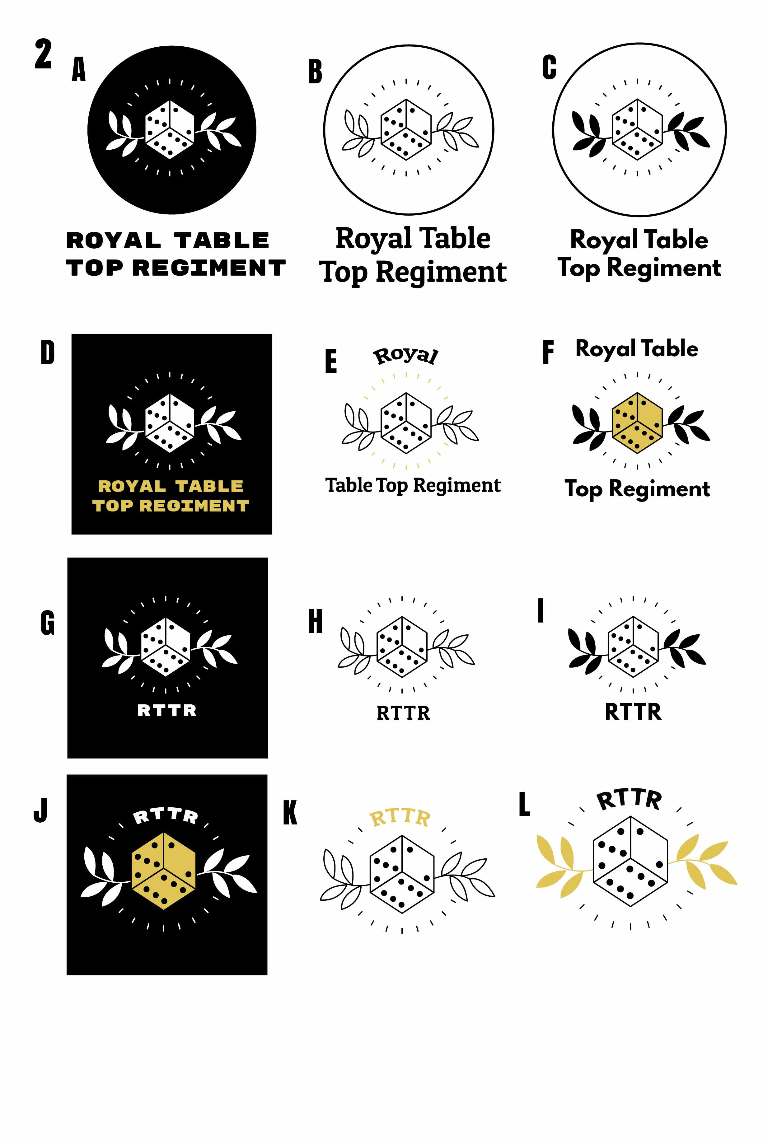
The typeface used for the RTTR wordmark is Rubik Mono One. The design of this sans-serif, monospaced typeface was inspired by the Rubik’s Cube. In addition to providing a modern edge to the design, the association with the Rubik’s Cube pays homage to the games played by this community of table top gamers. Rubik Mono One has a single weight and is used only for the wordmark and headings in the RTTR branding. In instances where RTTR’s branding requires a complimentary typeface, Objektiv MK1 is used.
Colour Scheme
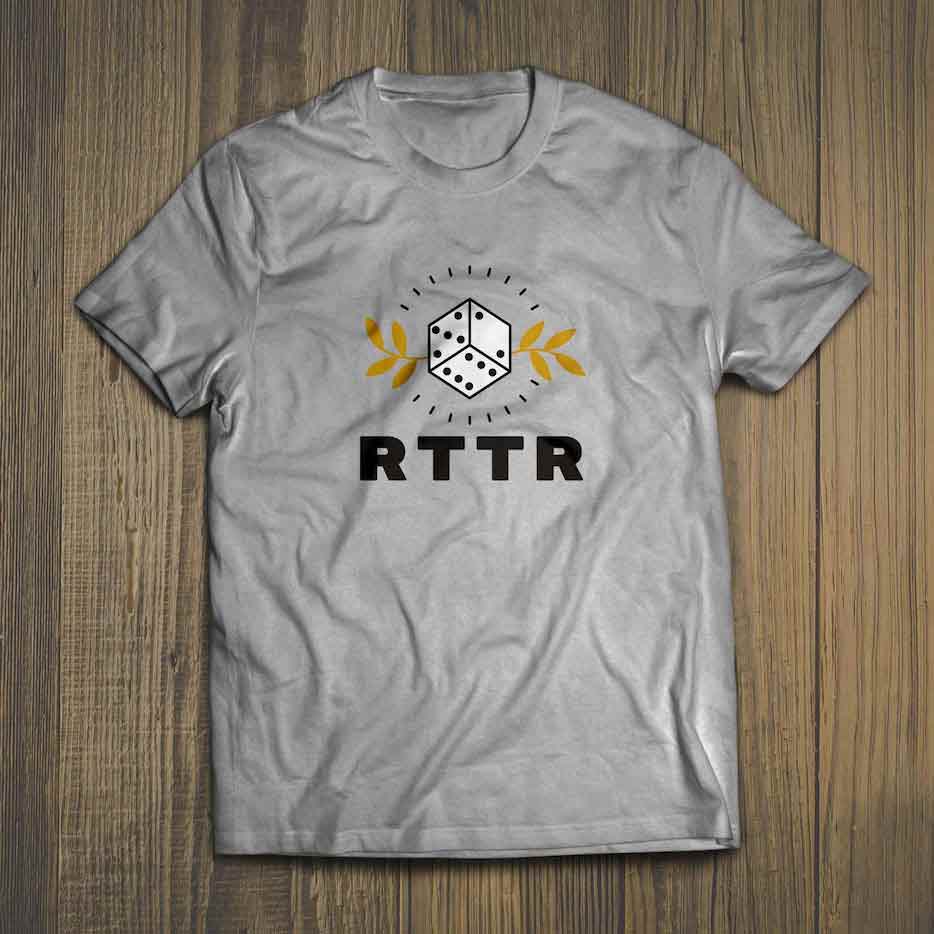
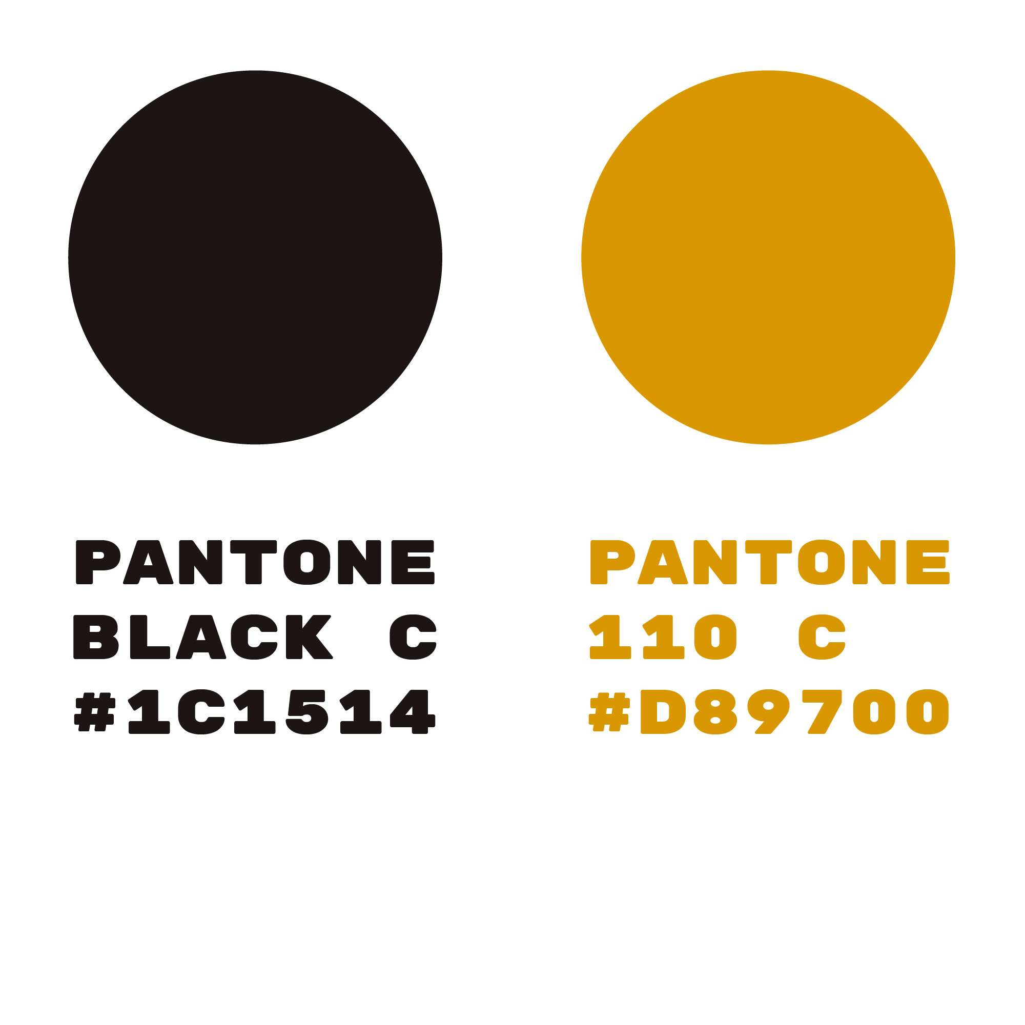
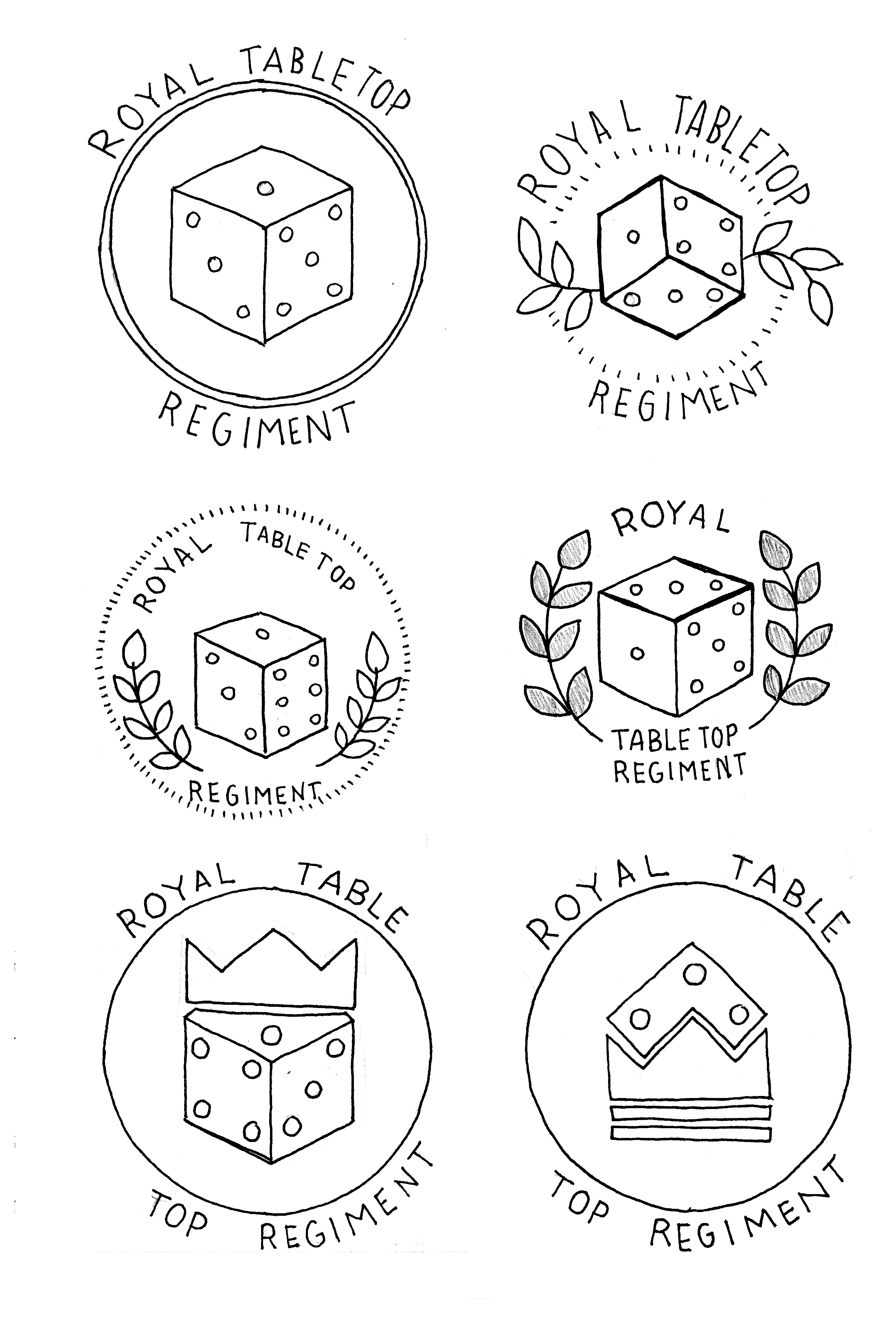
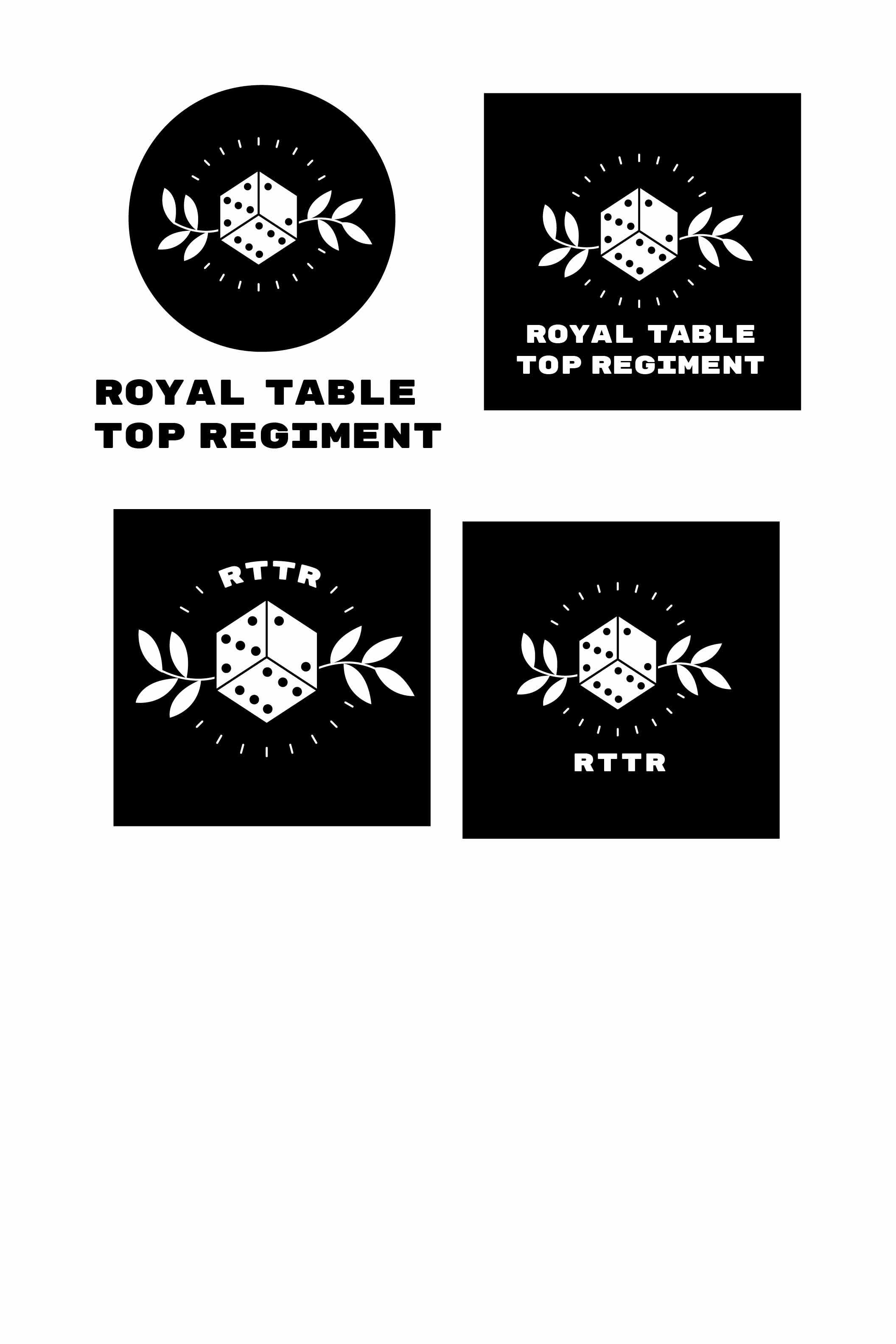
The Royal Table Top Regiment logo is inspired by the royal aspect of their name. The laurel wreath is a symbol which is synonymous with victory, royalty and honour. The colour scheme also references royalty with laurels displayed in gold.
Production
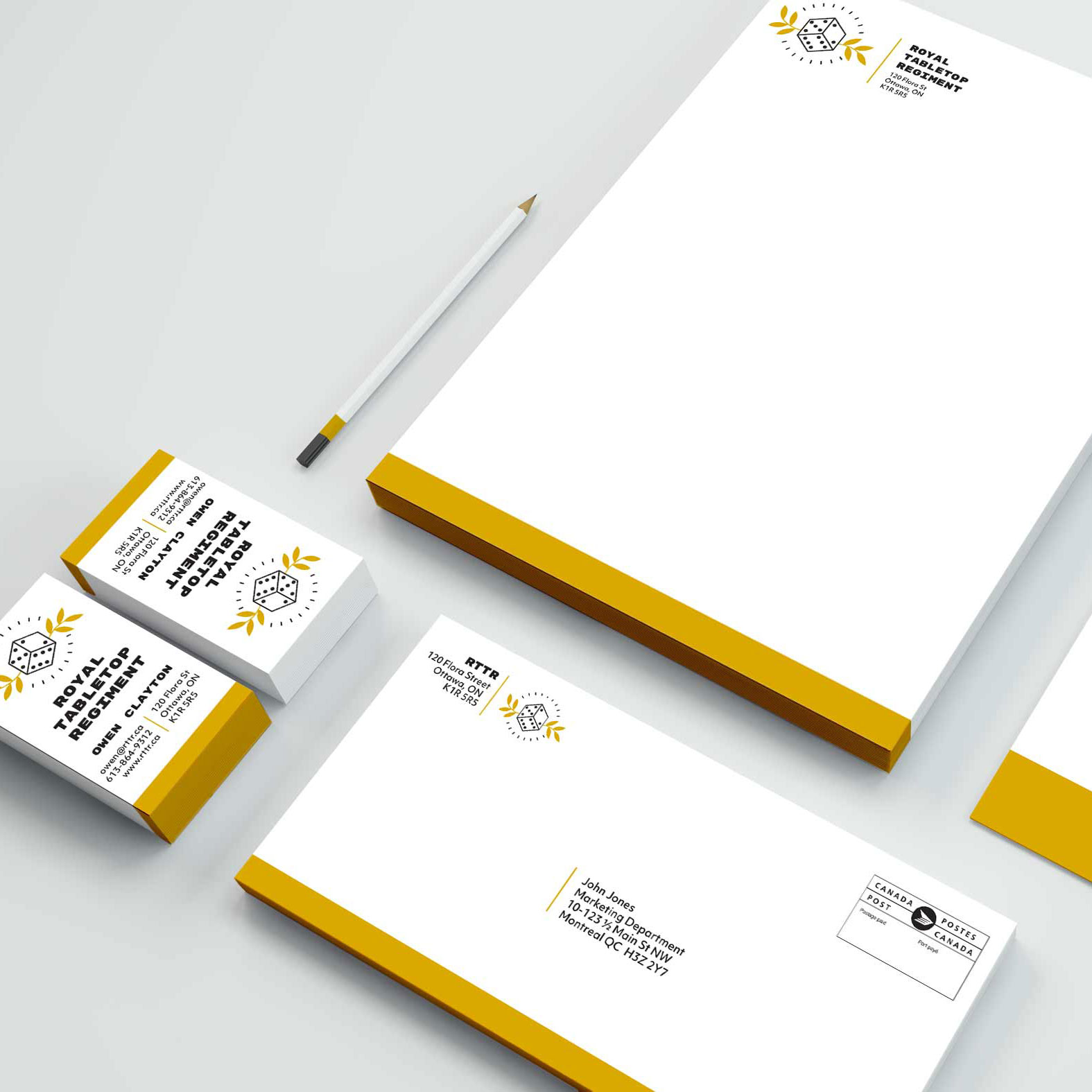
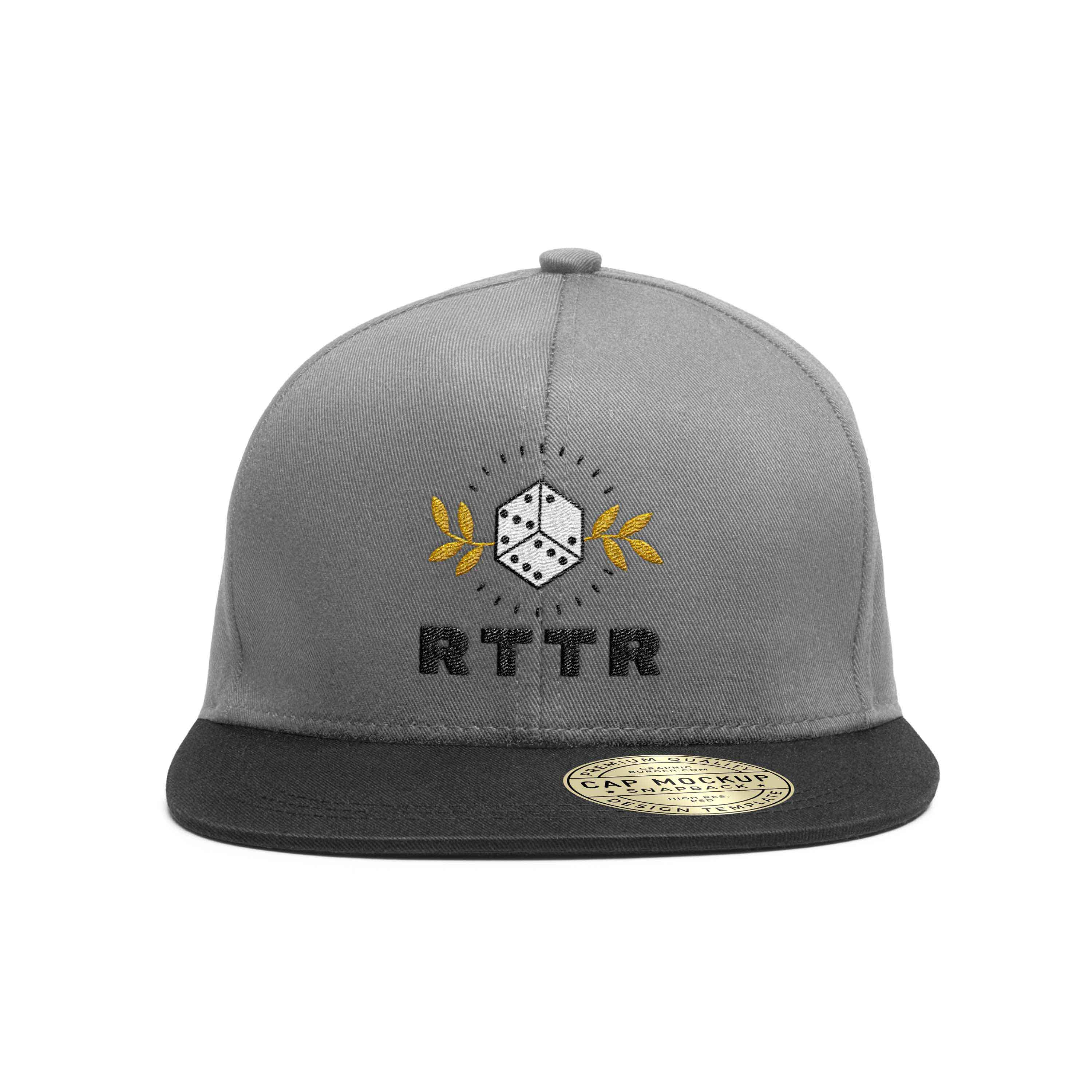
Application